New Kit!

  • Please bear with us on the new site integration and fixing any known bugs over the coming days. If you can not log in please try resetting your password and check your spam box. If you have tried these steps and are still struggling email [email protected] with your username/registered email address
  • Log in now to remove adverts - no adverts at all to registered members!
I like it. Only thing I don't like is the 'canaries' written on the back of the neck. I'd have gone back to the fully written out 'On the Ball City' that we had a few years ago, or '1902' if they're looking for something different. I know it's a minor detail, but there's no symbolism behind the word 'canaries'.
 
I like it, I agree with HfM that it would be better with OTBC but I reckon I'll be getting one of these. I might not get RvW, Fer, Hooper or Snoddy on the back just yet though!

Bah!
 
Yeah I'm a big fan. As far as I'm concerned Errea keep producing good kits every year I think that I won't buy this years, see it, then suddenly I'm £45 lighter. Last two years I've bought home and away.
 
http://www.canaries.co.uk/news/article/20140623-2014-15-kit-launch-1661276.aspx

This has really wound me up, but then I'm a pedant and do enjoy a rant. The marketing interview for this kit make the club look like ****ing amateurs

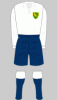
The unique yellow and green combination of this year's offering bears a strong resemblance to the kit donned by the Club's players way back in 1913.

"We're very happy with it. It's different from what we've had before. The last time we had so much green on the kit was nearly 90 years ago, so the fans are getting something unique.

There are two things that annoy me about thins statement, firstly 1913 is 101 years ago not 90, I know that style and the amount of green on the kit are subtly different so the 90 years could be referring to a different kit but they need to differentiate the statements better because currently they look like they can't count.

You must log in or register to see images

Secondly even if it is a problem with the sentence construction, the point is just plain wrong. The kit above was worn until 1947, which was 67 years ago and clearly has more green on the front than this years kit, intact the kit that we wore 90 years ago was white. This just seems like such a terrible interview to accompany what I thought was a pretty good video and marketing idea, i also really like the kit, as I stated above I will no doubt end up buying one.

Another thing that I think is a miss opportunity is that supposedly this is based on the last kit that was worn before, no doubt, several of the players and thousands of men from the city joined the war effort for the First world war. I think making this kit a tribute to the 3,500 norwich men who died in WW1 would have been an incredible classy touch, especially as the marketing is about the players and fans standing together, players and fans alike would have stood in the trenches neither more special than the other. I just found it slightly strange to make a reference to this kit being based on the one that preceded in 100 years ago without discussing the major event that took place 100 years ago, otherwise why was this the year chosen to based the design on not from 100 years previous?
 

Attachments

  • norwich_city_1923-1925.gif
    norwich_city_1923-1925.gif
    5 KB · Views: 6
its a very nice shirt. glad we still have errea, they've done some good stuff for us and although our colour scheme lends itself to a 'unique feeling', it is good to have a supplier who isn't one of the big name brands who just regurgitate the same templates year after year for a whole range of clubs.

i think bath makes some interesting points above with regards comments from the club being a little lazy and sometimes wrong (more green than before? did they not see last years shirt?!), but the club did play in a similar design exactly 100 years ago, as the nation went to war, so even if they haven't commented on the shirt in that context (which i agree is a shame and a missed opportunity, as i'd heard there was supposed to be some sort of tie-in) it does have some relevance.

http://www.historicalkits.co.uk/Norwich_City/Norwich_City.htm
 
At the risk of being accused of 'tightfistedness', I assume I'm correct that replica shirt prices - as well as match-day admission costs and players wages, of course, will all be reduced to reflect our new found 'lowlier' status in the football pyramid? :emoticon-0112-wonde

Wouldn't bet on it.
 
Every time i buy a number 10 shirt we end up selling the player and getting relegated Earnshaw Ashton and Fer , hopefully the hammy injury will keep Leroy with us as i don`t really like the new kit too much.
They look like the Australian one day cricket team .
 
its a very nice shirt. glad we still have errea, they've done some good stuff for us and although our colour scheme lends itself to a 'unique feeling', it is good to have a supplier who isn't one of the big name brands who just regurgitate the same templates year after year for a whole range of clubs.

i think bath makes some interesting points above with regards comments from the club being a little lazy and sometimes wrong (more green than before? did they not see last years shirt?!), but the club did play in a similar design exactly 100 years ago, as the nation went to war, so even if they haven't commented on the shirt in that context (which i agree is a shame and a missed opportunity, as i'd heard there was supposed to be some sort of tie-in) it does have some relevance.

http://www.historicalkits.co.uk/Norwich_City/Norwich_City.htm

Thank goodness someone agrees with me. So many on the EDP website are saying "why can't we have adidas/nike etc - NO THANK YOU!!!!!
 
I'm going to get it when I go back to the motherland in a couple of weeks. I really like it I thought last years was a bit naff so didn't get it, but I like the look of this :)
 
Thank goodness someone agrees with me. So many on the EDP website are saying "why can't we have adidas/nike etc - NO THANK YOU!!!!!

I am with you too! Adidas failed the year that stoke and Sunderland had almost exactly the same kit of red a white stripes!
 
Be interested to know if the photo below is actually legit. It looks like they're standing almost too close together and the fan's arm is missing. Perhaps two separate photos photoshopped. If so it makes a mockery of the tagline.

You must log in or register to see images